02 / Apple
10 hours/day saved
Designing 0→1 dashboard that supports manufacturing decisions for iPhone, Mac, iPad, Watch.
My scope
I led design across supply chain, quality and executive stakeholders, and with the engineering and data teams that built the product.
I owned:
- user research with operations teams on the factory floor and in the office
- the information architecture and interaction model
- data visualization and signal design
- the reusable design system behind the product
- alignment with engineering and data partners on a zero-downtime rollout
Screens in this case study are redacted. Station names, configurations and figures have been removed or replaced.
The dashboard had existed for a long time.
It was not built for one product. It served manufacturing operations across Apple's product lines — iPhone, iPad, MacBook, audio and home products, and others — each with its own metrics, stations and configurations.
It was heavy with data — hierarchical, multi-dimensional operational data — and everyone relied on it.
But relying on it and being served by it were not the same thing.
I had no manufacturing background when I joined. The first thing I did was learn from the users and domain deeply, and organise workshops to understand the problems they're facing.
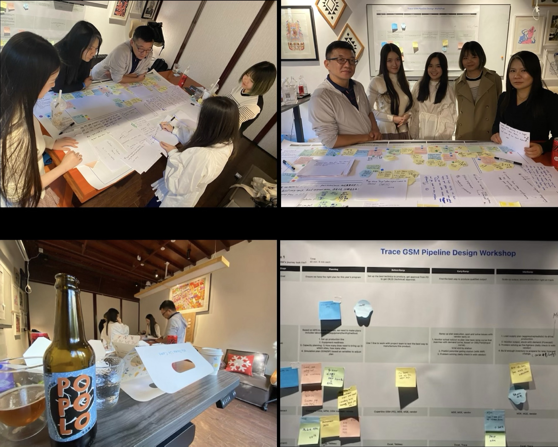
Operations teams had to look into tons of data per day for decisions on production. To design for them, I have to immerse into their context to understand their behavior and decision making process.
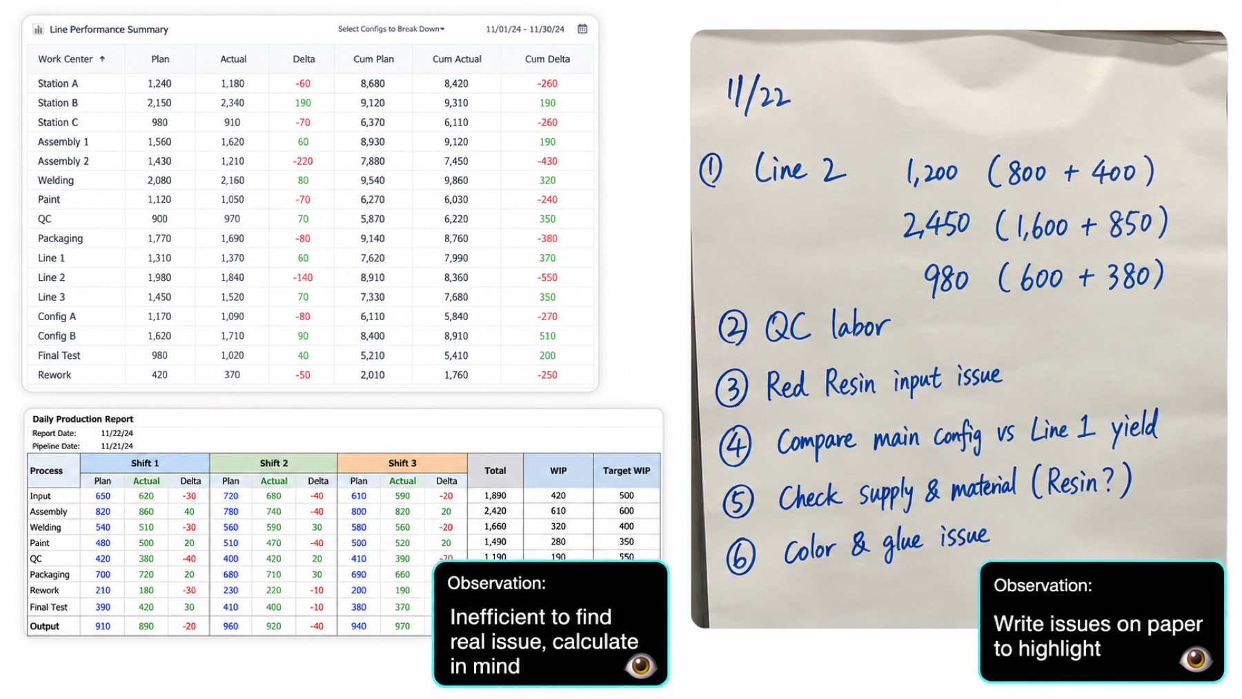
What people actually did to get an answer: scan the sheets, hold the subtraction in their head, then write the real issues out on paper. Source data and handwriting are obscured. The existing process works for them, as workaround exists for years. But new users coming getting confused, knowledge has to pass down frequently which add the pressure to change.
Instead of a better report, I designed the dashboard as a decision tool.
The question at every level moved from what is the number to what does this number ask me to do.
I explore different formats to signal the differences for understanding where the problem lies.
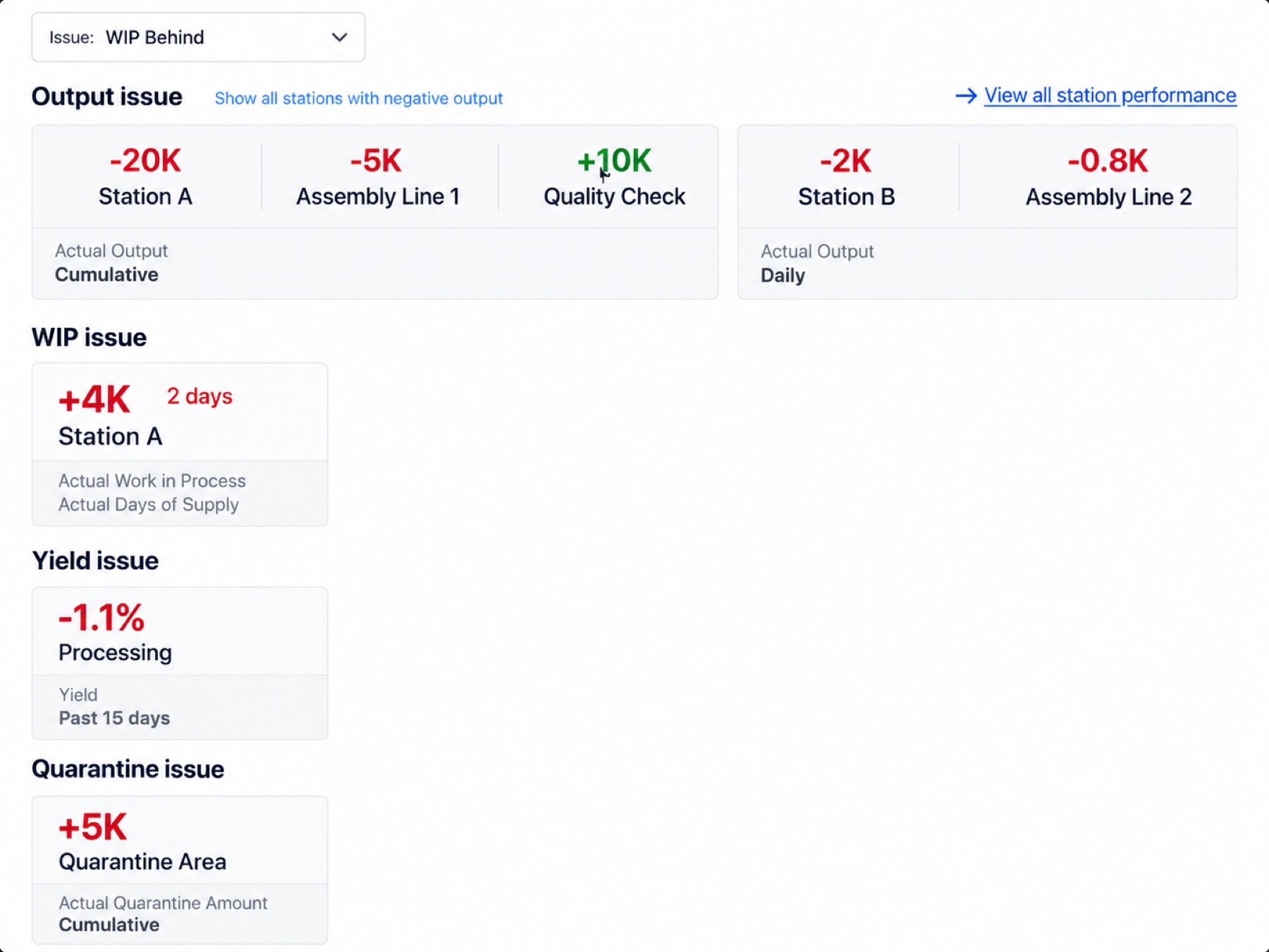
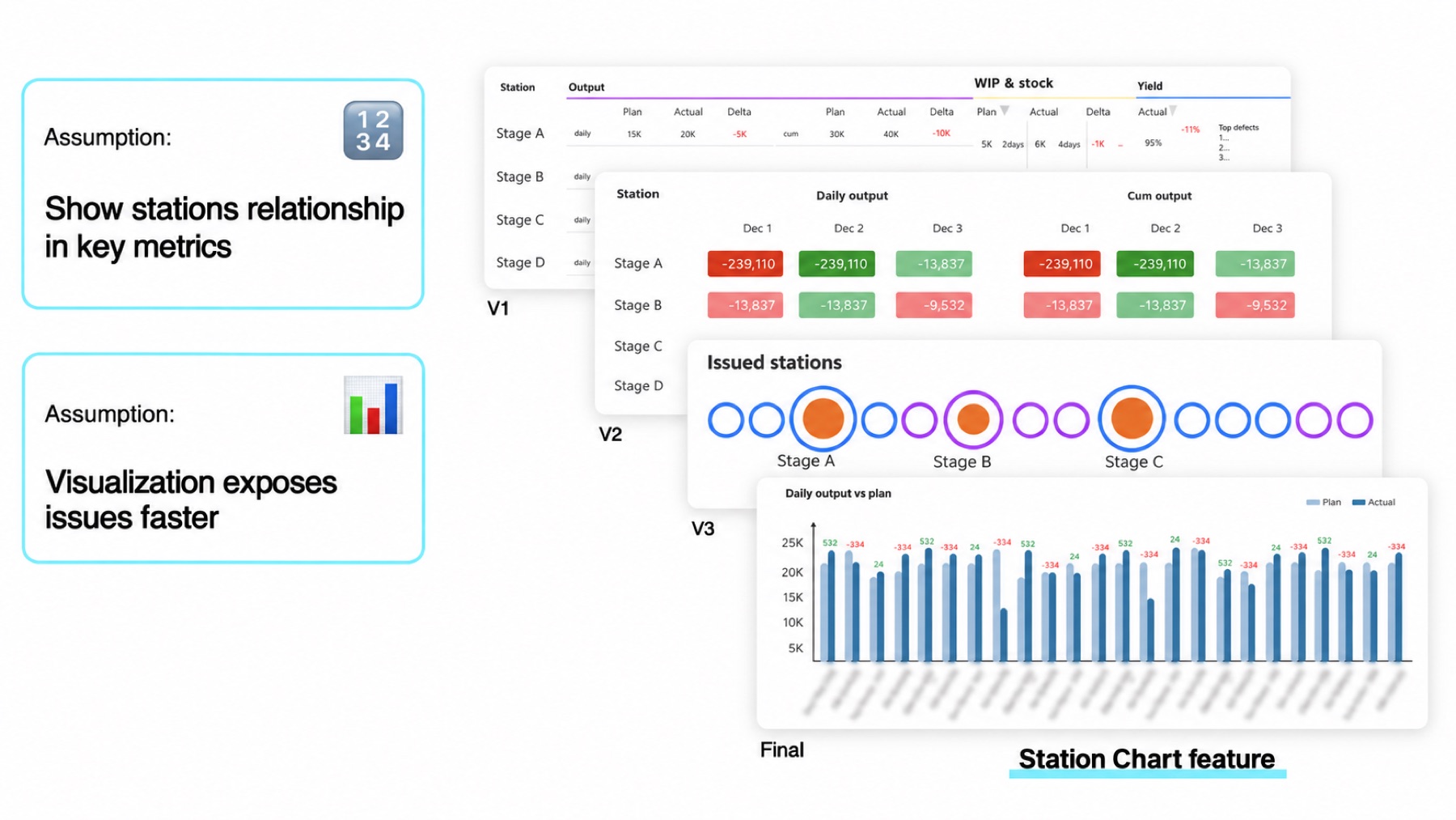
"It could be misleading as that might not be real issue." — User
Three principles shaped the design
This was not a product I could iterate on in the open.
The factory line runs operates every second and decisions rely heavily on the reporting. Any change to how people read operational data had to land with zero downtime — no interruption to a running process, no period where the team was less informed than the day before.
That shaped the whole approach: rigorous, staged, and designed so that the old and new could coexist until the new had earned trust.
The dashboard had to serve three departments, without becoming three products. Supply chain managers need it to identify potential supply blockers. Quality engineers need it to identify quality problems. Executives leadership need to understand high level overview of production.
I ran the process in three moves to ensure this happens:
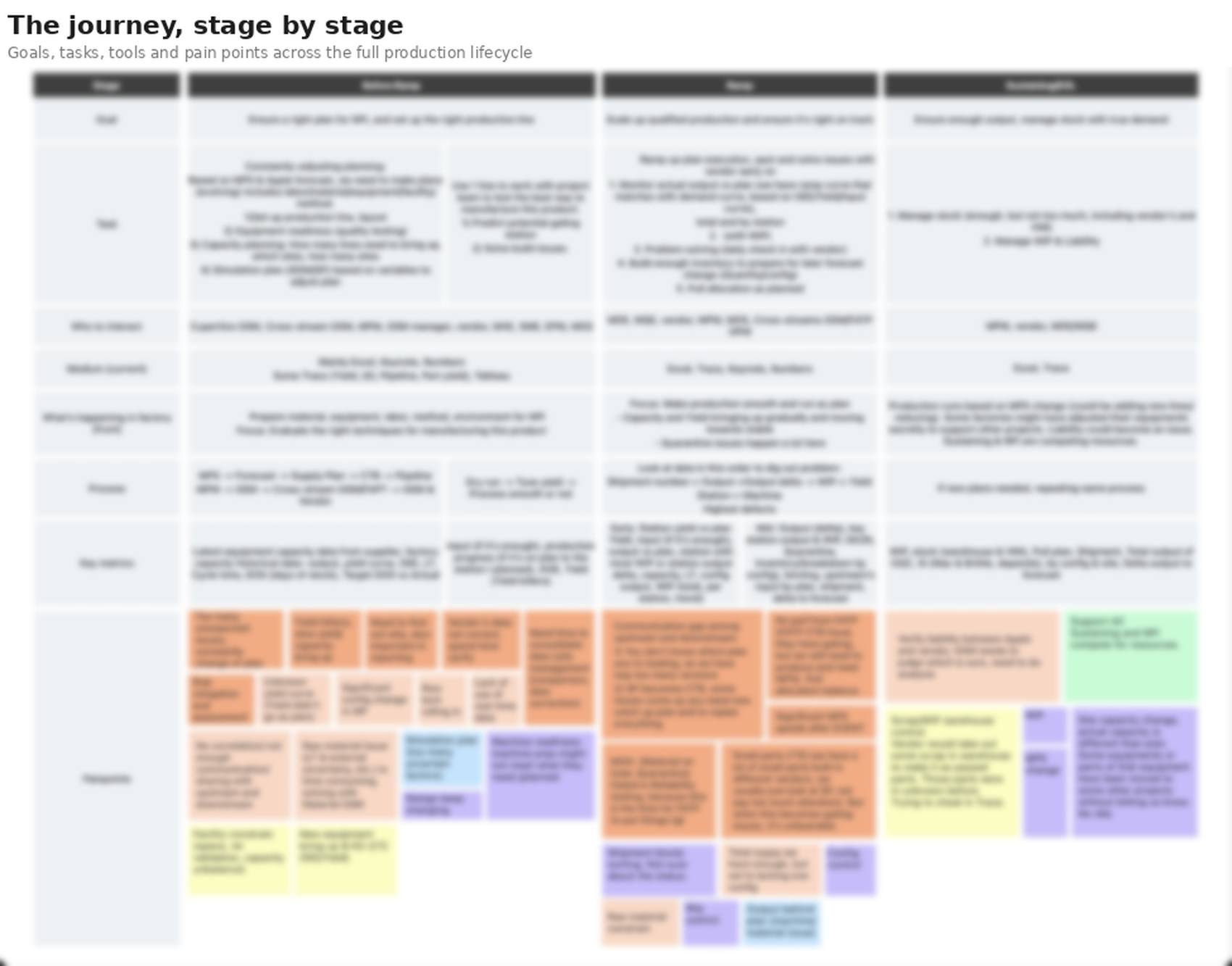
Journey mapping and Jobs-to-be-Done for what each role is trying to achieve at every stage, and where it hurts.
The design work here was holding three things in tension:
Every component in the design system was tuned against those three.
01 — See what changed: Anything asking for attention?
Signals are prioritised by deviation from expectation.
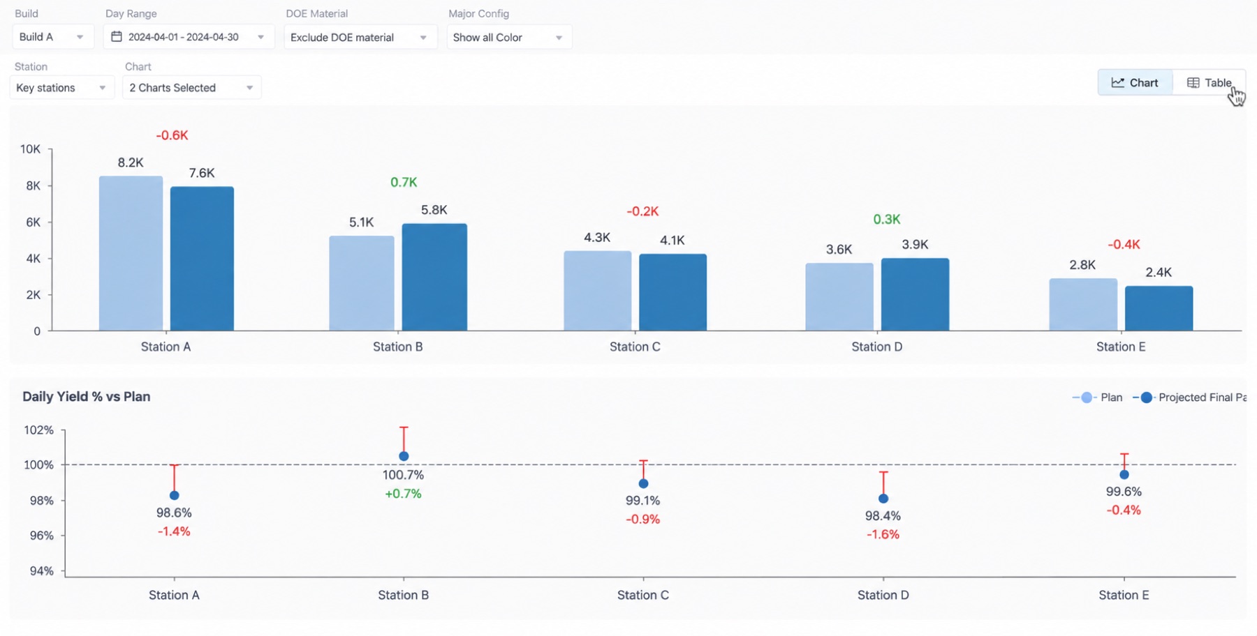
02 — Compare & Go deep to the cause
From a comparison, the person can move down the hierarchy — line → station → configuration — without losing the frame they started from.
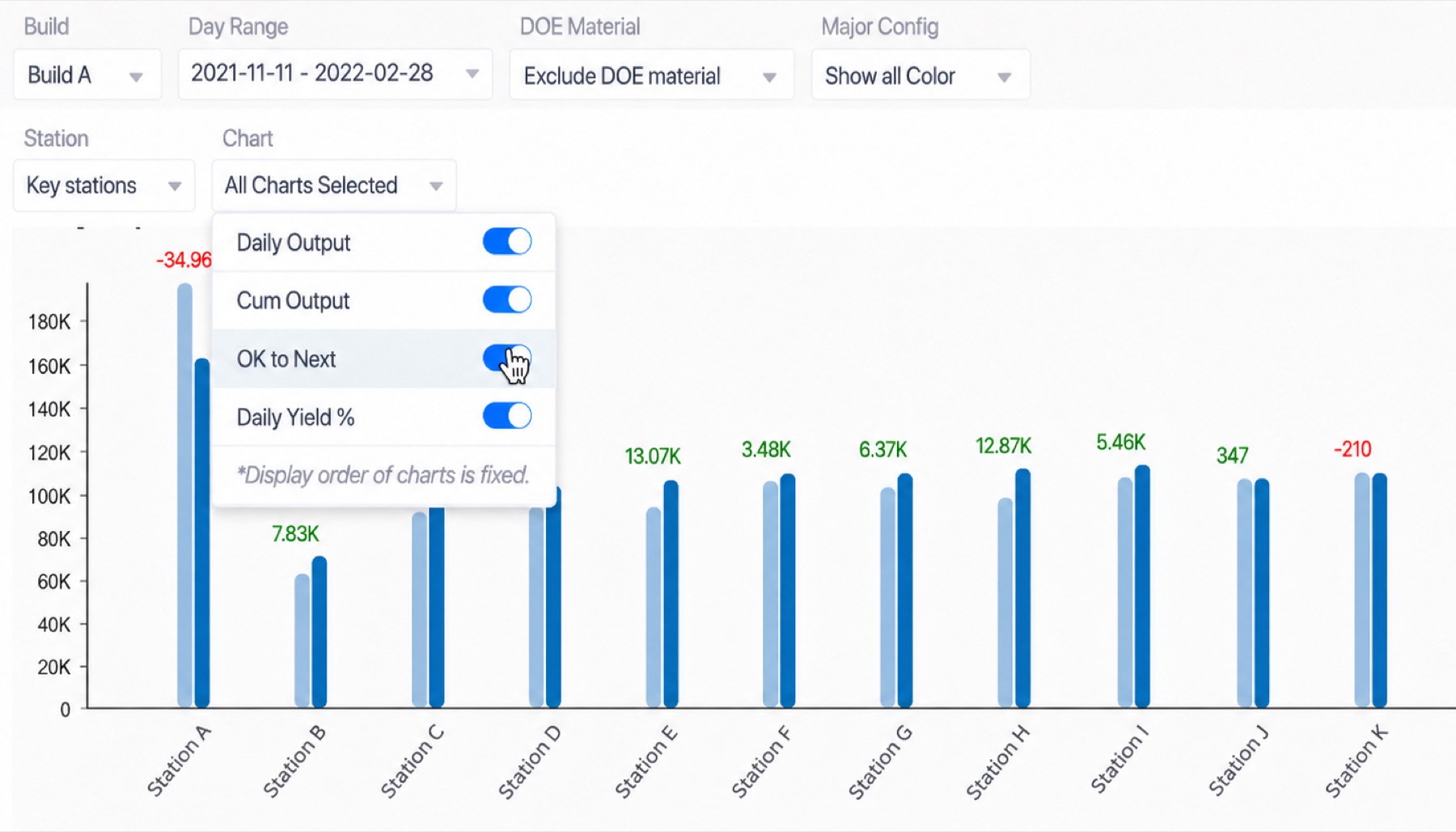
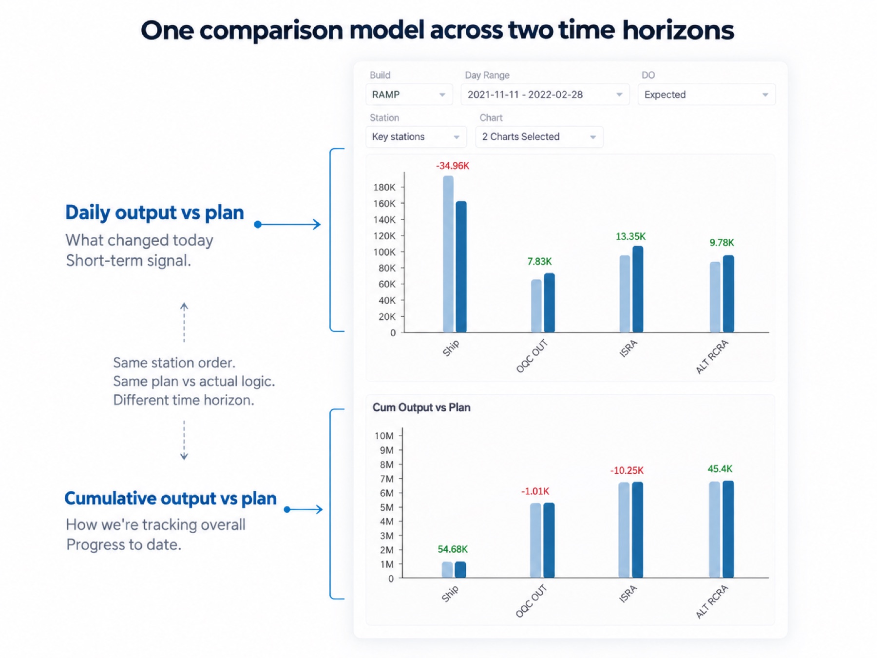
We preserve table view for what feels familiar with the users to maintain a smoother transition.
Moving the product from a place to read data to a place to decide, fast. The structure now carries the team's judgement about what matters, so that judgement does not have to be rebuilt from scratch every time someone opens it.